Publication Design for the Route 2 Literary Journal
I designed this book for Fitchburg State University’s student literary journal, Route 2. While working on this project, I decided the grids, typefaces, layouts, cover design, and design concepts that reflected the mood and content of the 160 page publication in visually meaningful ways. My vision for this journal sparked from my interpretation of the creative process behind writing:
The stories, worlds, and experiences that live within our minds overflow on to the page when we write, creating stories that awaken our souls. It all begins in our minds. At first, every thought and untold story can be jumbled up but it is a beautiful chaos. We have a beautiful way of thinking. We have beautiful minds.
In order to capture my poetic way of thinking about the creative process, I chose to create loose, abstract watercolor images for the cover and section breaks, incorporating hand-written words to further this feel. Balancing the elegant tone, I used geometric, bold typefaces to vary the texture and add visual interest. The cover design represents the beautiful minds behind the stories inside the journal, with the splash flowing from the woman’s head representing the creative process.
Furthering my theme of the creative process, the section break images flow together as a single narrative and work together as a continuing sequence telling the story of the cover in more detail.
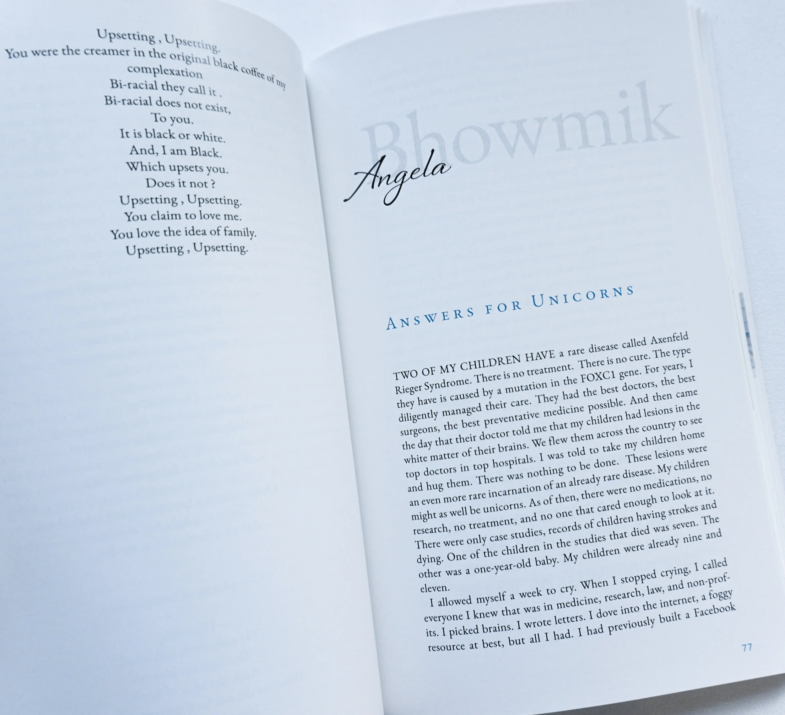
For the text pages, I chose an elegant typeface, Adobe Garamond Pro, to reflect the cover’s tone throughout the pages. I also mixed a script typeface and a bolder typeface for the authors’ names to tie in the cover while also placing the most visual interest on their names within the black and white pages. Ultimately, this journal showcases the talent and creativity of the students, and I wanted my design to honor and accentuate their hard work. 3/8” x 5.5” x 8.5”


